Is Your Neighborhood an Urban Heat Island?
Abstract
Have you ever noticed that on a hot day, it's more comfortable to wear a light-colored shirt than a dark one? Or that it's cooler in a park than walking down a street? This happens because different surfaces absorb and reflect heat in different ways. Urban heat islands are parts of cities where man-made surfaces like pavement and buildings replace natural surfaces like grass and trees. In this project, you will use temperature and satellite data to see if certain areas in a city have higher temperatures than others and learn how the type of surface affects temperature.
Summary
Some experience navigating and interpreting digital maps using tools like Google Earth or Google Maps.
Readily available
No issues
This project is loosely based on Esri's Map and analyze the urban heat island effect tutorial.
ArcGIS is a registered trademark of Esri.

Objective
In this project, you will use a free web-based tool called ArcGIS Online to create an urban heat island profile for a city of your choice and investigate the relationship between surface type, tree canopy cover, and air temperature.
Introduction
What are Urban Heat Islands?
Have you ever noticed that the weather forecast for a city often says it will be hotter than in the surrounding suburbs or farmland? Or that when you walk through a city on a hot day, some streets make you sweat while others provide much-needed relief from the blazing sun? These experiences can be explained by the urban heat island effect, which is when urban areas experience higher temperatures than surrounding rural areas. Watch the video below to learn more about urban heat islands.

What Causes Urban Heat Islands?
Urban heat islands form primarily because of the abundance of heat-absorbing surfaces in urban areas. Albedo refers to the reflectivity of a surface; the higher the albedo, the more sunlight is reflected off of it and therefore the less heat it holds. Albedo and heat retention depend on the land cover type. Light-colored surfaces, such as snow, have high albedo and therefore reflect most of the heat back into the atmosphere or space. However, in urban environments, dark-colored impervious surfaces created by buildings, concrete, and asphalt roads absorb and retain more heat than natural surfaces like grass or farmland. As a result, these surfaces radiate heat back into the lower atmosphere, leading to higher temperatures in the city compared to the surrounding suburbs or farmland. See Figure 1 for an example of what an urban heat island profile might look like for a typical city.
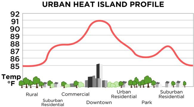 Image Credit: TheNewPhobia / Public domain
Additionally, the lack of vegetation and concentration of human activities also contribute to the formation of urban heat islands. Trees and plants help to cool the environment through a process called evapotranspiration. They release moisture into the air, which cools the surrounding area. In urban areas, the limited green spaces and trees prevent this natural cooling process, resulting in higher temperatures. We can measure the amount of tree canopy cover using satellite imagery. Finally, the constant use of energy, such as that by air conditioning, vehicles, and industrial processes, generates heat, which becomes trapped in urban environments. This excess heat further raises the temperature in cities.
Why do we care about Urban Heat Islands?
Urban heat islands have several impacts on urban areas and their residents. Higher temperatures can lead to increased energy consumption as people rely more on air conditioning to cool their homes and buildings. This, in turn, contributes to higher greenhouse gas emissions. Furthermore, the increased temperatures in urban heat islands can have negative health effects on individuals, particularly vulnerable populations such as the elderly and those with pre-existing medical conditions. The elevated temperatures can cause heat-related illnesses, heat strokes, and even exacerbate respiratory problems.
How do we study Urban Heat Islands?
Have you ever wondered how scientists create maps that show different temperatures or other data throughout a city? We can create these types of maps or data sets using a combination of temperature sensor networks and remote sensing. Remote sensing refers to the process of acquiring information about an object or phenomenon without coming into physical contact with it. It involves the use of various sensors, such as cameras or satellite imagery, to collect data from a distance. This allows for the study of large areas and the monitoring of changes over time. Watch the video below for more information about how this data is collected and analyzed.

Geographic Information Systems
One of the ways we can visualize and analyze remote sensing data is by using Geographic Information Systems, or GIS. GIS is a system designed to manage and analyze spatial or geographic (sometimes called 'geospatial') data. It combines data from various sources, such as maps, satellite imagery, and survey data, and allows us to overlay these data sets in order to visualize the relationships between the data and analyze them to find patterns.
In order to compare geographic datasets, it is important to make sure that they use the same map projection. Map projection refers to the process of representing the curved surface of the Earth on a flat surface, such as a map. Due to the Earth's spherical shape, it is not possible to create a perfectly accurate flat representation. Different map projections exist, each with its own strengths and weaknesses. We can identify a given location on a map projection using a coordinate system, the most common of which is latitude and longitude. Latitude is the angular distance north or south of the equator, while longitude is the angular distance east or west of the Prime Meridian. Together, these coordinates provide a unique identifier for any location on the Earth. Latitude and longitude can be reported either using degrees, minutes, and seconds (eg. 40°45'11"N, 73°58'59"W) or in decimals degrees (eg. 40.753056, -73.983056).
Types of GIS Data
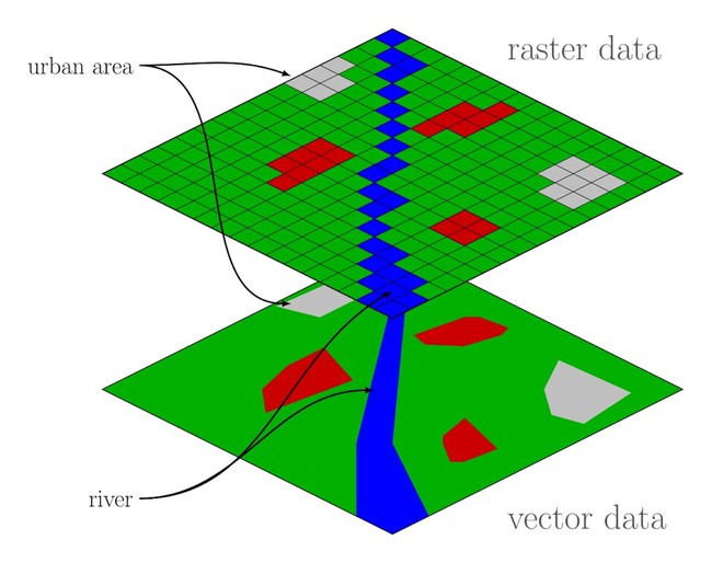
To do your GIS data analysis, you must understand the two major types of GIS geospatial data: raster and vector (see Figure 2).
- Raster data is a type of spatial data that is represented as a grid of cells or pixels. Each pixel contains a value, such as elevation, temperature, or land cover type. Raster data is commonly used in remote sensing and other applications that require continuous data over a large area. A pixel is the smallest unit of information in a raster dataset. It represents a single cell in the grid and contains a value that corresponds to a specific attribute or measurement. The resolution of a raster dataset refers to the size of each pixel and determines the level of detail that can be captured.
- Vector data is a type of spatial data that represents geographic features as points, lines, or polygons. Points represent individual locations, such as the coordinates of a city. Lines can represent straight or curved linear features, such as roads or rivers. Polygons represent areas or regions, such as the boundaries of countries or neighborhoods. A special kind of vector data that you will use in your study is a transect. A transect is a line or path that is used to sample or study a specific area or feature. It is often used in environmental or ecological studies to collect data along a predetermined route. Transects can be straight or curved, and multiple transects can be used to capture variation across a landscape.
Information about each piece of geospatial data (raster pixel or vector feature) is stored as an attribute and can include characteristics, measurements, or other descriptive data. An attribute table is a database that stores this information and allows for querying, sorting, and analyzing the attributes of different features in a GIS. For example, an attribute table for a given pixel of an elevation raster dataset will include information about the coordinates of the pixel, the pixel size, and the average elevation within the pixel.
In this project, you will use ArcGIS to analyze a variety of raster and vector datasets in your city in order to explore the relationship between surface type and temperature.
Terms and Concepts
- Urban heat island
- Albedo
- Land cover type
- Impervious surface
- Evapotranspiration
- Tree canopy cover
- Temperature sensor network
- Remote sensing
- Geographic Information System (GIS)
- Map projection
- Latitude and longitude
- Decimal degrees
- Geospatial data
- Raster data
- Pixel
- Resolution
- Vector data
- Transect
- Attribute
- Attribute table
Questions
- What types of geospatial datasets will you need to determine the impact of surface type on temperature? Do you think these are raster or vector datasets?
- What time of day do you think would be the most useful to collect temperature data to examine the impact of surface type on temperature?
- What surface types do you expect to have the highest temperatures? The lowest?
Bibliography
- HEAT.gov. (n.d.). About Urban Heat Islands. Retrieved February 12, 2024.
- My NASA Data. (n.d.). Urban Heat Islands. Retrieved February 12, 2024.
- Phoebe Gelbard. (2024, January 28). Mapping urban heat islands: A hot topic. Retrieved February 12, 2024.
Materials and Equipment
- Computer
- Free Online Account at NASA ArcGIS Online
- One of these supported browsers
Experimental Procedure
In this project, you'll use ArcGIS Online to create an urban heat island profile. The major steps you will take are:
- Create a free ArcGIS Online account.
- Add data sets for the city of your choice (including land cover type, tree canopy cover, impervious surface cover, and evening air temperature).
- Set a transect for data collection.
- Plot and gather data points along the transect.
- Graph and analyze your data to form conclusions about the influence of surface type on air temperature.
Refer to the tutorial video for a visual overview of these instructions; the video timestamp for each step is included in parentheses at the end of the step instructions.
- For this project, you will need to set up a free NASA ArcGIS Online Hub Community Account. Navigate to the NASA ArcGIS Online page, click 'Sign In', choose 'Create a NASA ArcGIS Online Hub Community account,' create an account, and log in. (0:39-0:46)
NOTE: The procedure described below and shown in the video represents the ArcGIS user interface as of the writing of this project. The organization and appearance of this interface may change over time, but the tools and overall process should remain similar. - Navigate to the Map Viewer page, choose ‘Save as,’ give your map a descriptive name related to your project (e.g., Seattle Urban Heat Island Map), and save it. You also have the option to add Tags or a Summary to your map to help others understand its purpose. (0:48-1:00)
- ArcGIS allows you to view multiple geographical data sets layered on top of each other. There are many open-source datasets available for you to choose from. From the ‘Layers’ menu, choose ‘Browse layers’ and then search in the ArcGIS Online library. (1:18-1:48)
The layers you will need for this project are:-
- USA NLCD Impervious Surface Time Series
- USA NLCD Tree Canopy Cover
- USA NLCD Land Cover
- Imagery Layer Evening Air Temperature in ‘City’ (choose a city from the list below*)
*These are the cities with available data as of the writing of this project, but more may have been added since then. To find out if another city has available temperature data, do the same search as described above with your city of interest.
- Albuquerque, NM
- Arlington and Woburn, MA
- Arlington, VA
- Atlanta, GA
- Burlington, VT
- Charlottesville, VA
- Cincinnati, OH
- Clarksville, IN
- El Paso, TX
- Farmville, VA
- Fort Lauderdale, FL
- Harrisonburg, VA
- Kansas City, MO
- Las Cruces, NM
- Providence, RI
- Raleigh/Durham, NC
- Sacramento, CA
- Salem, VA
- San Bernadino, CA
- San Jose, CA
- San Juan, PR
- Seattle, WA
- Victorville, CA
- Washington, DC
-
- Take some time to explore and understand each layer that you added to your map. From the ‘Layers’ menu, click the three dots and choose ‘Show properties.’ Be sure to follow any links that explain the layer in greater detail. You can also click on the dataset in various places on the map and explore the attribute table that pops up. (1:49-2:40)
For each layer, make sure you understand the following and document it in your lab notebook:- What do the different colors of the layer represent? What units* are they measured in?
*Note: These layers tend to use imperial rather than metric units. You should check with your teacher about the requirements for using metric vs. imperial units of measurement on your project. - What is the source of the data? Who created it, and for what purpose? What methods did they use to collect the data? When was the data collected?
- Is the data a raster dataset or a vector dataset? If it is raster, what is the cell size (i.e., what area on the ground does each pixel cover)?
- What information in the attribute tables is the most important for answering your research question?
- What do the different colors of the layer represent? What units* are they measured in?
- Turn off the visibility on all the layers except your Evening Air Temperature layer and zoom so that you can see the full extent of the temperature data.
In order to create your urban heat island profile, you will need to define one or more transects (or lines) along which to collect your data. A few things you should consider when choosing your transect are:- What specific research question are you trying to answer? Do you want to map the heat profile for the whole city? For a specific neighborhood? Are there specific land cover types (e.g. farmland vs. parking lots) you want to compare?
- Consider scale when choosing your transect. In order to see meaningful trends in the data, you will need your transect to be long enough that it covers a variety of land cover types, tree canopy levels, impervious surface levels, and temperatures. Avoid very short transects (at least 5 miles or 8 km in length is a good general guideline) or that have very homogenous (similar) data. You can use the ‘Measurement’ tool (Map Tools → Measurement) to get a sense of scale on your map.
(2:41-3:34)
- Once you have decided on the location for your transect, you will need to add it as a vector to layer to your map. From the ‘Layers’ menu, choose Add → Create Sketch Layer. Change the Sketch type to ‘Line’ and give the layer a descriptive title. You can also adjust the line type and color to fit your preferences. Add the transect line to the map by clicking to start the transect, extending the line to the endpoint, and double-clicking to end the line. (3:35-3:59)
- Next, you will define the points along your transect where you will collect data.
You will need to determine the number and spacing of your data collection points depending on the length of your transect and the research question you are trying to answer. For example, if your transect is 10 miles (16 km) long and you want a total of approximately 40 data points, you will need to space your points 0.25 miles (400 m) apart). You will also want to use the measurement tool to look at the scale of your data sets along your transect; if the data you are interested in has large changes every mile, you will want to make sure your spacing is smaller than that.
To add your data points, go to the ‘Layers’ menu and choose Add →Create Sketch Layer. Make sure the Sketch type is set to ‘Point.’ Be sure to give each point a unique name/number in the 'Title' field so that you can tell them apart later. You may want to take note of any important landmarks (parks, buildings, neighborhoods, major highways/interstates, bodies of water, etc.) in your lab notebook as you create the data points.
Start by adding a point to the left side of your transect line. Then, use the measure tool (Map tools → Measurement) to measure the distance along your transect to the next data point. It can be challenging to navigate between the Sketch and Measurement tools, so it may help you to work from your base map and take note of a landmark for each measurement so you can remember where to add your next data point. Continue measuring and adding points until you get to the end of your transect. Be sure to save your map frequently! (4:00-5:18) - Now you are ready to collect your data! Set up a data table similar to the one below in a spreadsheet (like Google Sheets or Excel) or in your lab notebook.
Data Point Coordinates Land Cover Type Tree Canopy Cover % Impervious Surface % Evening Air Temperature (degrees F*) Notes 1 2 3 etc. *Remember, you should check with your teacher about the requirements for using metric vs. imperial units of measurement on your project.
Collect your data by turning on one layer at a time and clicking on each data point to determine the raster value at that point. You will also want to use the ‘Location’ tool (Map tools → Location) to find the coordinates for each point. Decimal degrees (DD) is an easy option for tracking your coordinates.
Be sure that you are zoomed in far enough that you can select the same pixel for each dataset. You can experiment with different workflows (collecting all data at one point vs. collecting all data for a single layer, etc.) to determine what works best for you.
Enter each data point in your data table. (5:19-6:55) - Once you have collected your data, create a graph to examine the relationships between the data. You can create a line graph where the x-axis is the distance along your transect, the left y-axis is temperature, and the right y-axis is % cover (for both impervious surface and tree canopy cover) to show the relationships between temperature, impervious surface, and tree canopy cover. (6:56-7:20)
Questions to ask yourself when analyzing your data include:- Is the relationship between temperature and impervious surface direct or inverse? What about the relationship between temperature and canopy cover? Is one relationship more consistent than the other?
- Do you notice any trends related to land cover type? What surface types tend to be the hottest? The coolest?
- Are there any places that do not follow the temperature pattern you expected? What surface features might help explain these differences?
Ask an Expert
Global Connections
The United Nations Sustainable Development Goals (UNSDGs) are a blueprint to achieve a better and more sustainable future for all.


Variations
- ArcGIS Pro, which has a paid student version available, offers a wider variety of quantitative analysis tools. Explore these tools and consider more advanced analyses such as determining where heat islands overlap with at-risk populations or how temperatures vary by city district.
- Both the Impervious Surface and Tree Canopy Cover layers are time-series, which means they show data over time. Can you explore how these surfaces have changed in your neighborhood or across the city over time?
- Create heat profiles for a specific route across the city. Maybe this is the route that you use to walk to school, the route of a historical walking tour, or the route trucks take to get through downtown. What variations do you see in temperature and surface type along this route? How might this impact the people who use it?
Careers
If you like this project, you might enjoy exploring these related careers:


Related Links
- Science Fair Project Guide
- Other Ideas Like This
- Weather & Atmosphere Project Ideas
- Environmental Science Project Ideas
- My Favorites
- How Does Color Affect Heating by Absorption of Light?